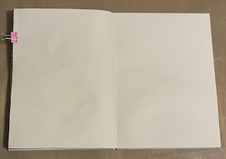
1. Start again with a blank spread, but this entry involves a third page (kept single). There two outer pages were glued together again with gel medium, but there is no painting involved in this entry, so you don't have to glue to outer pages.
I used gel medium, because the pages in this particular book bleeds with the markers and I didn't want that to spoil the other pages.
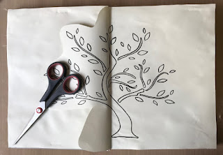
2. This entry uses two stencils. The primary design use this tree stencil, but you can use any tree stencil that you like. It just needs to be wide enough to cover at least half of the two pages in the spread.
The second stencil is shown further down.
3. Use a waterproof pen and draw the stencil outline on the spread close to the middle.
Mark the edge of the stencil (shown here with the green and purple arrows) in pencil.
Cut around the tree but leave enough space at the bottom to cover the tree and tree trunk when the single (middle) page is turned over.
Flip the stencil and draw the tree on the other side.
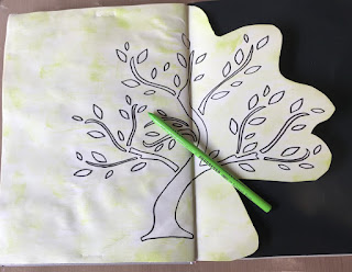
4. Here you can see the flip side of the page.
The pencil marks on the page were used to align the stencil to ensure the overlap is as close as possible. It does not have to be perfect though.
The tree on the left-hand side of the spread is not visible.
The stencil outline was flipped with the tree trunk now leaning the other way.
5. I used ink and a dry art sponge to colour the pages around the tree, also in between the branches. But I made sure not to cover the lines of the tree itself.
You can also use a dauber or your finger to get the same effect with the ink.
6. I couldn't get enough coverage with the ink and sponge and decided to use a colour pencil as well. It is a soft pencil and I made sure to hold it fairly horizontal so that it didn't make obvious lines when I used it to fill in the background.
The pencil is almost the exact same shade of green as the ink I used. I was lucky because I didn't plan on using coloured pencils for this entry. I was however, very pleased with the final outcome. Will definitely consider using coloured pencils again.
7. I used Lyra brush markers in light colours to colour in the tree on the green side of the entry.
The tree trunk was done with a brown marker, and I used the same brown marker on the other side of the page.
This side symbolises the lighter (happier) side of life.
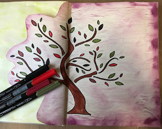
8. I made the right-hand side of the design in purple. Using ink on the edges with the dry sponge, and then used two coloured pencils for the colouring in the rest of the pages around the tree.
Then I coloured the tree with dark colours from the Lyra brush marker set.
This side symbolises the heavier (difficult or challenging) side of life.
9. The pencils: Koh-I-Noor Hardmuth Progresso Yellowish Green, French Pink, and Bordeaux Red.
The inks: Distress Ink Twisted Citron, and Seedless Preserves.
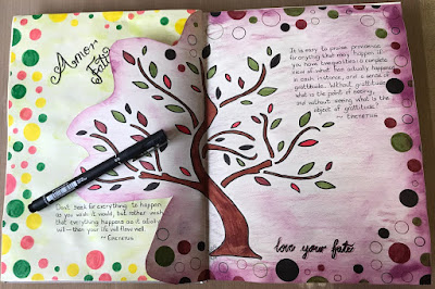
10. Add the text "Amor Fati" to the green side with a waterproof pen.
I drew circles in random sizes around the green side and coloured them with the same light coloured Lyra brush markers you saw in (7).
The circles were done with a stencil (11).
11. Repeat the circles on the purple side of the design and colour with the darker brush pens shown in (8)
I did not colour all the circles in the purple entry, to add to the symbolism of emptiness or difficult times in life.
The stencil is shown here.
The words "love your fate" is added to the purple side and shown in (10)
The final design with two quotes from Epictetus added with the
black UniBall waterproof pen (0.8mm nib)
"Don't seek for everything to happen as you wish it, but rather wish that everything happens as it actually will--then your life will flow well." ~Epictetus
"It is easy to praise providence for anything that may happen if you have two qualities: a complete view of what has actually happened in each instance, and a sense of gratitude. Without gratitude what is the point of seeing, and without seeing what is the object of gratitude?" ~EpictetusUntil the next instalment in this series!
Be creative and love your life, just the way it is.
💜 Linzé










.jpg)
