C is for Colour
We all need a little colour in our lives whether it be literally, or metaphorically. Today I am focusing on the literal meaning of the word. I am sometimes teased because my favourite colour is black. My engineering friends and colleagues (including Francois) constantly tell me that black is not a colour. Well, technically I suppose they are correct since black does not feature in any colour of light. Note: if you mix all the colours of the rainbow (in lightwaves) you get white, but no combination will ever give you black.
When mixing paints you do get black, but let's not argue that point.
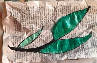
Today I want you to explore your favourite colours in an art entry in your journal. I have done mine with the video clips you find below.
Before you watch (and dig in) a few pointers:
- Wear an old t-shirt to protect your clothes. Most water-based paints will set permanently once dry and ruin your clothes. A lesson I learned once when I dropped a paintbrush covered in black paint on my favourite denim-blue tennis shoes. I went out and bought the eye-blindingly bright pink housecoat you see me wearing in the video clips (now I paint with those shoes!). It works, what more can I say.
- You are most welcome to copy my designs for your journal or use your own. Keep it simple, something you can draw and paint in a matter of minutes.
- If you want to use another medium or design that takes longer to be ready, allocate the space in your journal to glue it in later when it's ready.
- Use the link here, to find your colour (or its closest match) and pen your thoughts about that. Remember to explore your emotions about the colour, as well as your experience of doing the art project for today's prompt.
Hints and tips:
- Put down a layer of plastic on your work surface to protect it from the paint. I used a plastic bag that I cut open.
- Put newspaper on top of the plastic. It will absorb any excess moisture and prevent your artwork from unwanted bleeding across the paper.
- Try to use only the text part of the paper. Any pictures will create odd colours or shading of your design.
- Measure your journal's page size and cut the paper rectangles the same size or smaller. This way you know the end result will fit.
- Remove any jewellery from your hands. Paint sticks to everything and will dry quickly because of your body's heat. If your wedding ring has no gemstones, grooves or uneven surfaces like engravings, it may not be a problem, but the smallest crevice will be very hard to clean once the paint is dry.
- I put my hair in a ponytail because I have accidentally painted the ends a time or two and then the paint gets transferred to my face or glasses. But that's just me.
- Lastly, enjoy the art project!
Watch the short YouTube Videos!
My favourite colours, what they mean, and my thoughts on that
Black
According to the website, it is a colour of mystery and secrecy. While I would like to think that I am mysterious and secretive, the closest I ever get to that are the mystery novels I love to read. Deep down I don't think I want to be mysterious.
Perhaps because I am an introvert who is happy to be on my own or left alone to do my own thing. Took me years to figure that part out. Only when I got to know other writers, did I begin to understand this part of myself. Interesting thing to discover in your early thirties, I can tell you.
But knowing this also allowed me to more easily accept this part of myself. Understanding it has been a journey, but I feel that understanding this part of me, helps me define my path to happiness.
Purple
This is the colour of creativity. My mother used to tell me that it is the only colour where you can wear any shades of it together without clashing with yourself. I am no fashionista and have no interest in dressing fashionably (if I do, it is pure luck), so I don't know if that is true. What I do know is that creativity is something I am still learning about every day.
After reading The Artist's Way, it opened even more doors in my mind. While I love my art projects, I have not experimented much simply because of my (mistaken) notion that painting (irrespective of the medium) was the only true expression of visual art, excluding sculpting.
Logically, I know that is not true, but until recently painting was all I did. I liked it, but it didn't grab me by the throat to drag me to the blank canvas. Only once I started experimenting with pastels and pencil do I feel as if I have truly found my art. I have a lot still to learn, but learning is easier for me if I have a passion for the subject.
It was the same for my engineering studies until I discovered electromagnetism in my third year. But that is something to explore at another time.
Jade
The closest colour to jade (or teal) on the website is turquoise. According to the website, it is the colour of balance because it sits right in the middle of the rainbow (mix of blue and green).
Sheesh, was I surprised when I read that the first time. There is no way I can convince myself that my choice of jade as a favourite, can have anything to do with my Live in Balance motto for this year. I have always loved this colour (it is also one of the few colours that both my mother and I liked equally), so the meaning cited on this website was pure coincidence, but not an unwelcome explanation!
When I think about my three favourite colours and their meanings, I am quite happy with the combination. Of course, there are negative connotations too, but I prefer to focus on the positive. I am striving for happiness after all!
👉 What have you learned today about your favourite colour(s)?


